LipidSig: a web-based tool for lipidomic data analysis
1 Profiling
Lipidomics technology provides a fast and high-throughput screening to identify thousands of lipid species in cells, tissues or other biological samples and has been broadly used in several areas of studies. In this page, we present an overview that gathers comprehensive analyses that allow researchers to explore the quality and the clustering of samples, correlation between lipids and samples, and the expression and composition of lipids.
1.1 Data source
Lipid expression data can be uploaded by users or example datasets are also provided.
1.1.1 Try our example
The demo dataset is using data from ‘Adipose tissue ATGL modifies the cardiac lipidome in pressure-overload-induced left ventricular failure.’ by Salatzki, J. et al. (1). Human plasma lipidome from 10 healthy controls and 13 patients with systolic heart failure (HFrEF) were analyzed by MS-based shotgun lipidomics. The data revealed dysregulation of individual lipid classes and lipid species in the presence of HFrEF.
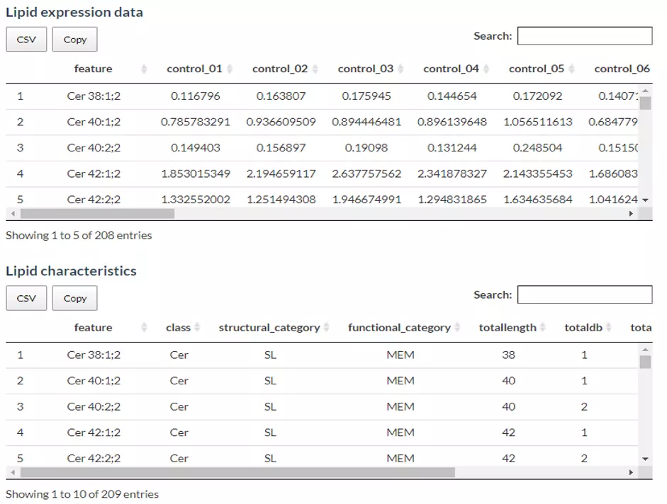
Figure 1 The Demo Dataset of Profiling Analysis.
1.1.2 Upload your data
In this section, users can directly view and check the quality/correctness and the information of the expression data and lipid characteristics (optional) by the expression of the lipid species (features) in each sample. Note that the Lipid expression data, and Lipid characteristics (optional), needs to be uploaded in the CSV/TSV format. Data processing options are listed below, comprising ‘Remove features with many missing values’, ‘Missing values imputation’, ‘Percentage transformation’, ‘Log10 transformation’. ‘Percentage transformation’, ‘Log10 transformation’ can transform data into log10 or percentage. After clicking on ‘Remove features with many missing values’, the threshold of the percentage of blank in the dataset that will be deleted can be defined by users. Additionally, when selecting ‘Missing values imputation’, users can choose minimum, mean, and median to replace the missing values in the dataset. If users select minimum, minimum will be multiplied by the value of user inputted. After uploading data, three datasets will show on the right-hand side. When finishing checking data, click ‘Start’ for further analysis.
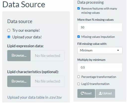
Figure 2 User-selected Panel for Lipid Profiling Analysis.
1.2 Cross-Sample Variability
In this page, three types of distribution plot provide a simple view of sample variability. The first histogram depicts the numbers of lipids expressed in each sample. The second histogram illustrates the total amount of lipid in each sample. The last density plot visualizes the underlying probability distribution of the lipid expression in each sample (line). Through these plots, users can easily compare the amount/expression difference of lipid between samples (i.e., patients vs. control).
1.2.1 Number of expressed lipids
Through this histogram, users can discover how many lipid species present in each sample, which provides an overview that depicts the total number of lipid species over samples.
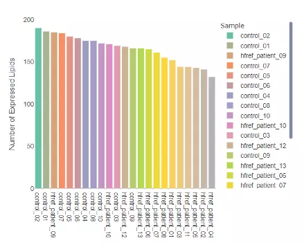
Figure 3 Histogram of Number of Expressed Lipids.
1.2.2 Lipid Amount
The histogram here can be used to check the variability of the total lipid amount between samples.
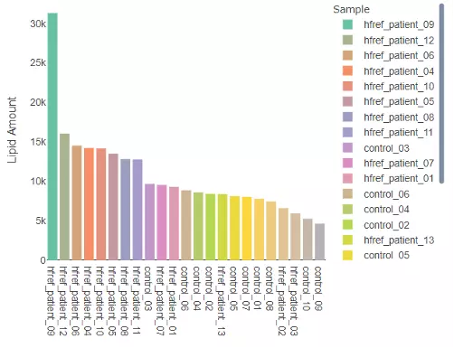
Figure 4 Histogram of Lipid Amount.
1.2.3 Expression distribution
The density plot uncovers the distribution of lipid expression in each sample (line). All expression was log10 transformed. By hovering over the line, a box will suggest a specific expression level and the density of the point. Hence, users can have a deeper view of the distribution between samples.
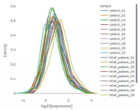
Figure 5 Density Plot of Expression Distribution.
1.3 Dimensionality reduction
Dimensionality reduction is common when dealing with large numbers of observations and/or large numbers of variables in lipids analysis. It transforms data from a high-dimensional space into a low-dimensional space so that to retain vital properties of the original data and close to its intrinsic dimension.
Three dimensionality reduction methods are provided, PCA, t-SNE, UMAP. Additionally, four clustering methods, K-means, partitioning around medoids (PAM), Hierarchical clustering, and DBSCAN, can be reached by clicking pull-down menu. The number of groups shown on (PCA, t-SNE, UMAP) plot can also be input by users (default is two groups).
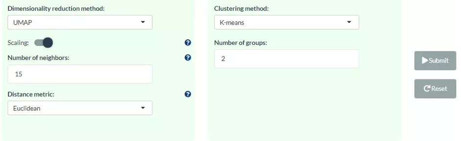
Figure 6 Interface of User-defined Parameter for Dimensionality Reduction.
1.3.1 Principal component analysis (PCA)
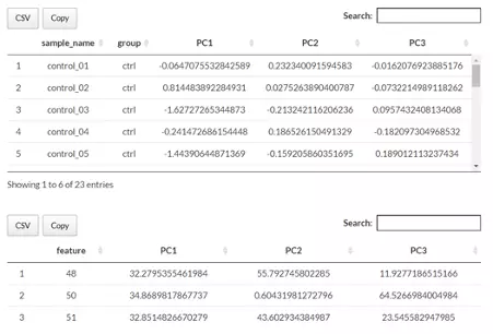
PCA is an unsupervised linear dimensionality reduction and data visualization technique for high dimensional data, which tries to preserve the global structure of the data. Scaling (by default) indicates that the variables should be scaled to have unit variance before the analysis takes place, which removing the bias towards high variances. In general, scaling (standardization) is advisable for data transformation when the variables in the original dataset have been measured on a significantly different scale. As for the centring options (by default), we offer the option of mean-centring, subtracting the mean of each variable from the values, making the mean of each variable equal to zero. It can help users to avoid the interference of misleading information given by the overall mean. After users submitting the PCA plot will show. In this section, R package "factoextra" is used to visualize the results.
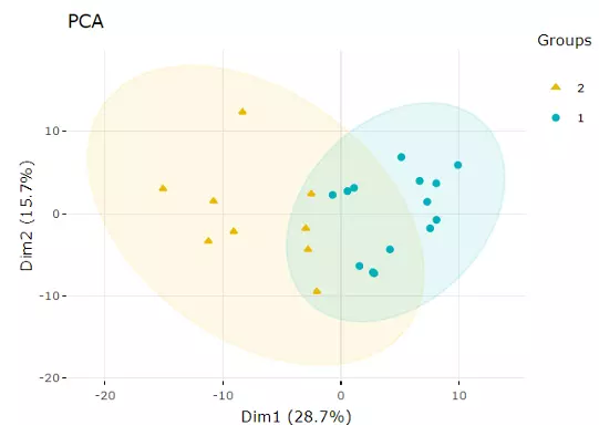
Figure 7 An Example of a PCA plot.
Accompanying with the PCA plot, we offer scree plot criterion, which is a common method for determining the number of PCs to be retained. The "elbow" of the graph indicates all components to the left of this point can explain most variability of the samples.
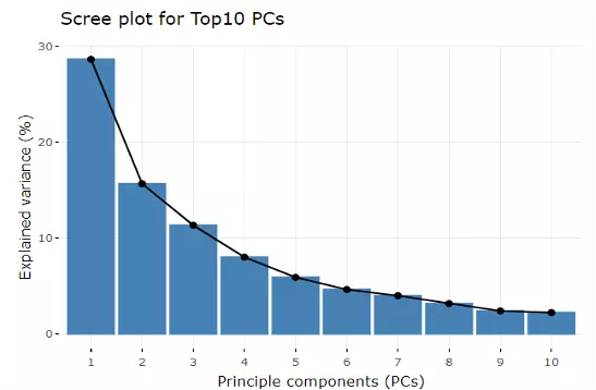
Figure 8 Scree Plot.
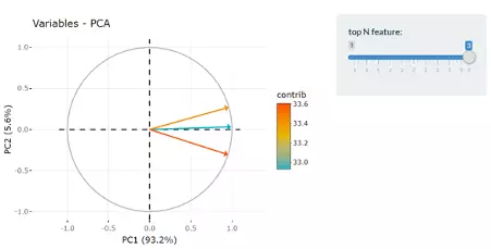
Next, two tables related to PCA are also provided for users to see the contribution to each principal component in each sample and the contribution of each feature (lipid species). By using this information above, users can further decide the top N contribution features and adjusting the slider. The correlation circle plot on the left will then show the correlation between a feature (lipid species) and a principal component (PC) used as the coordinates of the variable on the PC (2). It shows the relationships between all variables.. The positively correlated variables will be in the same quadrants, while negatively correlated variables will be on the opposite sides of the plot origin. The closer a variable to the edge of the circle, the better it represents on the factor map.
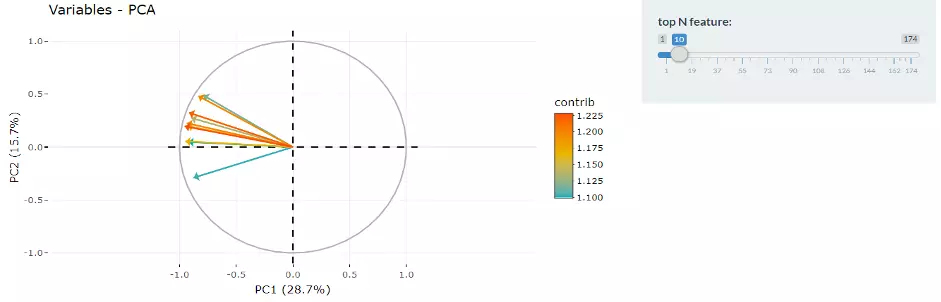
Figure 9 Correlation Circle.
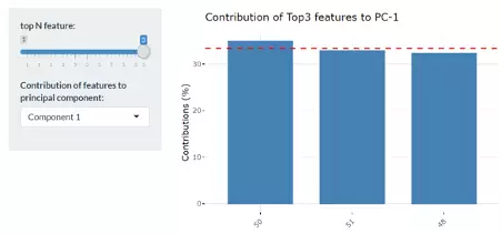
Lastly, by adjusting the slider of the top N feature on the bottom left, users can have a closer look at the contribution of features to a user-defined principal component (e.g., PC1, PC2 or PC1+PC2). Therefore, in the histogram on the right-hand side, users can find which features (lipid species) contribute more to the user-defined principal component.
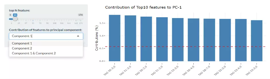
Figure 10 Bar Plot of Contribution of Top10 Features.
1.3.2 t-distributed stochastic neighbour embedding (t-SNE)
t-Distributed Stochastic Neighbour Embedding (t-SNE) is an unsupervised non-linear dimensionality reduction technique that tries to retain the local structure(cluster) of data when visualising the high-dimensional datasets. Package ‘Rtsne’ is used for calculation, and PCA is applied as a pre-processing step. In t-SNE, perplexity and max_iter are adjustable for users. The perplexity may be considered as a knob that sets the number of effective nearest neighbours, while max_iter is the maximum number of iterations to perform. The typical perplexity range between 5 and 50, but if the t-SNE plot shows a ‘ball’ with uniformly distributed points, you may need to lower your perplexity(3).
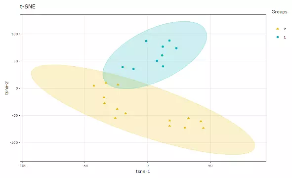
Figure 11 An Example of t-SNE plot.
1.3.3 Uniform Manifold Approximation and Projection (UMAP)
UMAP using a nonlinear dimensionality reduction method, Manifold learning, which effectively visualizing clusters or groups of data points and their relative proximities. Both tSNE and UMAP were intended to predominantly preserve the local structure that is to group neighbouring data points which certainly delivers a very informative visualization of heterogeneity in the data. The significant difference with TSNE is scalability, which allows UMAP eliminating the need for applying pre-processing step (such as PCA). Besides, UMAP applies Graph Laplacian for its initialization as tSNE by default implements random initialization. Thus, some people suggest that the key problem of tSNE is the Kullback-Leibler (KL) divergence, which makes UMAP superior over tSNE. Nevertheless, UMAP’s cluster may not good enough for multi-class pattern classification. (4).
Users can also choose the type of distance metric to use to find nearest neighbours, including "euclidean" (the default), "cosine", "manhattan", and "hamming". Moreover, scaling to apply to input data if it is a data frame or matrix. ‘The size of the local neighbourhood’ indicates the size of the local neighbourhood (as for the number of neighbouring sample points), which is used for manifold approximation. Larger values lead to more global views of the manifold, whilst smaller values result in more local data being preserved. In general, values should be in the range of 2 to 100. (15 by default).
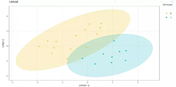
Figure 12 An Example of UMAP Plot.
1.4 Correlation Heatmap
Correlation heatmaps illustrate the correlation between samples or lipid characteristics and also depict the patterns in each group. The correlation can be calculated by Pearson or Spearman. The correlation coefficient then is clustered depending on the user-defined method: median, average, single, complete, Ward.D, Ward.D2, WPGMA, and UPGMC and distance: Pearson, Spearman, Kendall, Euclidean, Maximum, Manhattan, Canberra, Binary, or Minkowski correlation. Furthermore, user have to select a characteristic among class, structural category, functional category, total length, total db, total oh, for displaying the heatmap of lipid characteristics. Please note that if the number of lipid samples or characteristics is over 50, the names of samples/characteristics will not be shown on the heatmap.

Figure 13 Interface of User-defined Parameter for Correlation Analysis.
1.4.1 Heatmap of sample-sample correlations
The first heatmap reveals sample-sample correlations. The correlation between samples is calculated by the selected correlation method. Then, the correlation coefficients are hierarchically clustered by user-defined clustering method and distance. Correlations between lipid species are colored from strong positive correlation (red) to no correlation (white).
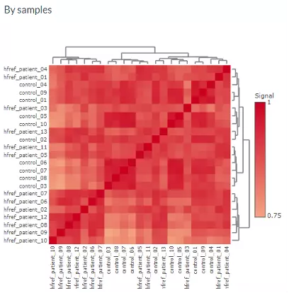
Figure 14 Heatmap of Sample-Sample Correlations.
1.4.2 Heatmap of lipid characteristics correlations
The second heatmap reveals correlations between lipid characteristics. The correlation is calculated by the user-defined lipid characteristics. Correlations between lipid species are colored from strong positive correlation (red) to no correlation (white), to negative correlation (blue).
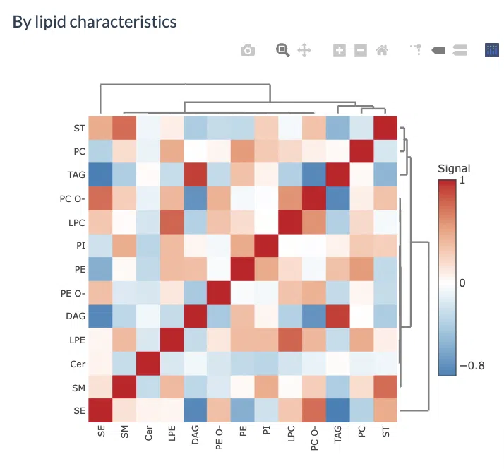
Figure 15 Heatmap of Lipid-lipid Correlations.
1.5 Lipid Characteristics
In this page, users can discover lipid expression over specific lipid characteristics by scrolling the dropdown menu. Lipids will be firstly classified by the selected characteristics from ‘Lipid characteristics’ table uploaded by users. Next, the lipid expression will be shown in the bar plot, which depicts the expression level of each sample within each group (e.g., PE, PC) of selected characteristics (e.g., class). Additionally, a stacked horizontal bar chart tells the percentage of characteristics in each sample. For instance, if users select the class as lipid characteristics from the dropdown menu, the stacked bar chart will tell users the percentage of TAG, ST, SM etc. of each sample, the variability of percentage between samples can also be obtained from this plot.
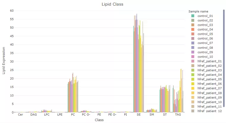
Figure 16 An Example of Bar Plot Classified by User-selected Characteristic.
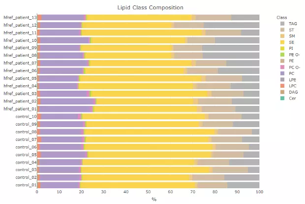
Figure 17 An Example of Lipid Class Composition.
2 Differential expression
In Differential Expression Page, significant lipid species or lipid characteristics can be explored through two main customised analysis, by ‘Lipid Species’ or ‘by Lipid Specific’ , with user-uploaded data. Subsequently, further analysis and visualisation methods, including dimensionality reduction, hierarchical clustering, characteristics analysis, and enrichment, can be implemented based on the results of differential expressed analysis by utilising user-defined methods and characteristics.
2.1 Data source
Lipid dataset can be uploaded by users or using example datasets (Salatzki, J. PLoS genetics 2018). This information, namely Lipid expression data , Group information , and Lipid characteristics needs to be uploaded in CSV format. ‘Lipid expression data’ contains the feature, which is the Identification of differential lipids, such as Cer 38:1;2 or LPC 16:0, followed by several columns of samples and their values (percentage).
2.1.1 Try our example
Demo dataset from ‘Adipose tissue ATGL modifies the cardiac lipidome in pressure-overload-induced left Ventricular failure’ (1) encompasses human plasma lipidome from 10 healthy controls and 13 patients with systolic heart failure (HFrEF), which analysed by MS-based shotgun lipidomics. The data revealed dysregulation of individual lipid classes and lipid species in the presence of HFrEF.
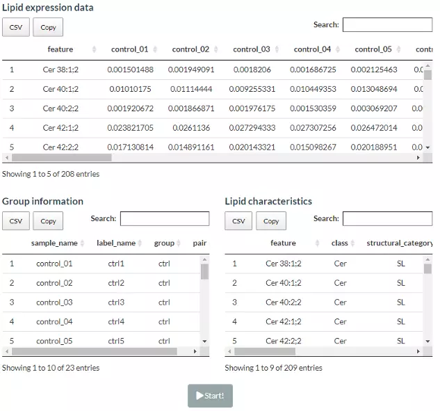
Figure 18 The Demo Dataset of Differential Expression Analysis.
2.1.2 Upload your data
Lipid dataset can be uploaded by users or using example datasets. This information, namely Lipid expression data , Group information , and Lipid characteristics (optional), needs to be uploaded in CSV format with the name of lipids in the first column. Data processing options are listed below, comprising ‘Remove features with many missing values’, ‘Missing values imputation’, ‘Percentage transformation’, ‘Log10 transformation’. ‘Percentage transformation’, ‘Log10 transformation’ can transform data into log10 or percentage. After clicking on ‘Remove features with many missing values’, the threshold of the percentage of blank in the dataset that will be deleted can be defined by users. Additionally, when selecting ‘Missing values imputation’, users can choose minimum, mean, and median to replace the missing values in the dataset. If users select minimum, minimum will be multiplied by the value of user inputted. After uploading data, three datasets will show on the right-hand side. When finishing checking data, click ‘Start’ for further analysis.
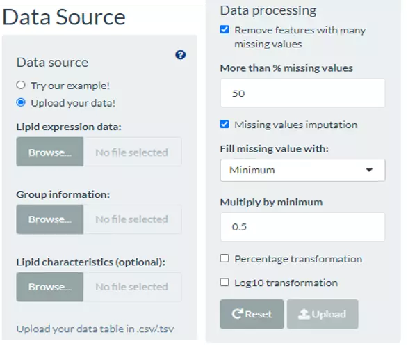
Figure 19 Panel for User-defined Parameters of Differential Expression Analysis.
2.2 Lipid species analysis
2.2.1 Step1: Differentially expressed analysis
In the lipid species analysis section, differentially expressed analysis is performed to find significant lipid species. In short, samples will be divided into two groups (independent) based on the Group Information of input. Two statistical methods, the t-test and Wilcoxon test (Wilcoxon rank-sum test) are provided and the p-value will be adjusted by the Benjamini-Hochberg procedure. The condition and cut-offs for significant lipid species are also users selected. Please note that the fold change defined here means only the target lipid species with numbers of fold up-regulation or down-regulation than control will be selected and shown on plots and tables.
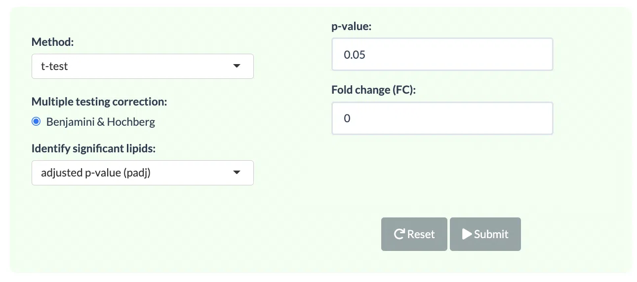
Figure 20 The Panel for Users to Select Statistical Methods.
After submitting the selected approach, one table and three plots will tell the differentially expressed results. The table with statistic information will show, and significant lipid species will be highlighted in pink according to the threshold chosen by users. Next, the lollipop chart reveals the lipid species that pass chosen cut-offs. The x-axis shows log2 fold change, while the y-axis is a list of lipids species. The point colour is determined by -log10(adj_value/pvalue). When hovering over the point, the information of log2(Fold Change) and -log10(adj_value/pvalue) will show in the box. MA plot indicated three groups of lipid species, up-regulated(red), down-regulated(blue), and non-significant(grey). For more information about individual lipid species, please move the mouse to the point. The lipid species of interest will appear in the boxplot on the right-hand side with their expression level by groups. It follows by volcano plot, indicating the similar concept with MA plot. These points visually identify the most biologically significant lipid species, up-regulated is in red, down-regulated is in blue, and non-significant is in grey. The expression boxplot of each lipid species (each point) will show as hovering over it.
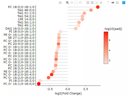
Figure 21 Lollipop chart of Lipid Species Analysis.
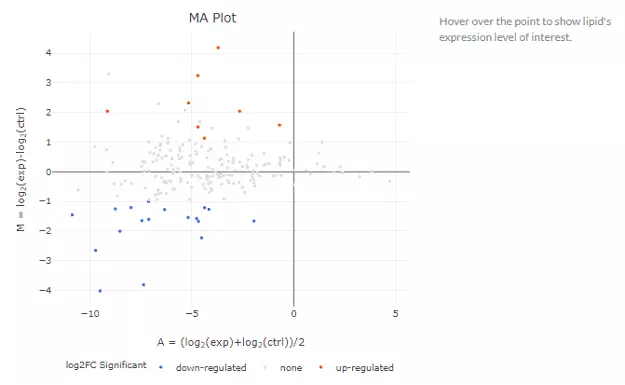
Figure 22 MA plots of Lipid Species Analysis.
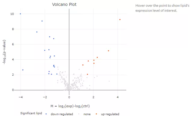
Figure 23 Volcano plot of Lipid Species Analysis.
2.2.2 Step2: Visualization of DE lipids
The following analyses are using data filtering from previous Differentially Expressed Analysis. Further analysis includes Dimensionality Reduction, Clustering, Lipid Characteristics, and Enrichment.
2.2.2.1 Dimensionality reduction
Dimensionality reduction is common when dealing with large numbers of observations and/or large numbers of variables in lipids analysis. It transforms data from a high-dimensional space into a low-dimensional space so that to retain vital properties of the original data and close to its intrinsic dimension.
Four dimensionality reduction methods are offered, namely PCA, PLS-DA, t-SNE, UMAP. Additionally, clustering methods, such as K-means, partitioning around medoids (PAM), Hierarchical clustering, and DBSCAN, can be reached by clicking pull-down menu. Scaling (by default) indicates that the variables should be scaled to have unit variance before the analysis takes place, which removing the bias towards high variances. In general, scaling (standardization) is advisable for data transformation when the variables in the original dataset have been measured on a significantly different scale. As for the centring options (by default), we offer the option of mean-centring, subtracting the mean of each variable from the values, making the mean of each variable equal to zero. It can help users to avoid the interference of misleading information given by the overall mean. After submitting the plot will show by selecting. For more details of dimensionality reduction methods, please see section 1.3.
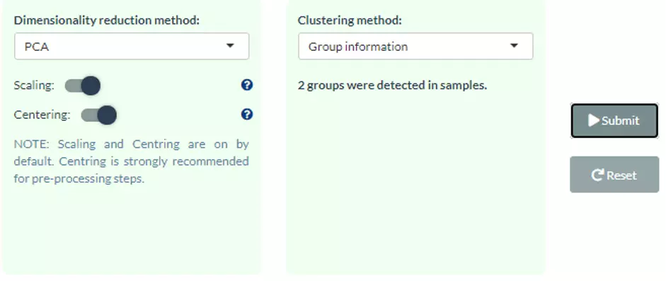
Figure 24 The dimensionality reduction method selection panel.
This section offers extra dimensionality reduction method, PLS-DA. For the plot of PLS-DA, the distance from the centre of the variables in the PLS-DA loading plot indicate the contribution of the variable. The value of x-axis reveals the contribution of the variable to PLS-DA-1, whereas the value of y-axis discloses the contribution of the variable to PLS-DA-2.
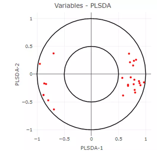
Figure 25 PLS-DA loading plot of Differential Expression Analysis.
2.2.2.2 Hierarchical clustering
Lipid species that derived from two groups will be clustered and visualised on heatmap using hierarchical clustering. Through heatmap, users may discover the difference between the two groups by observing the distribution of lipid species. This analysis provides an overview of lipid species differences between the control group and the experimental group. Please note that if the number of lipids or samples are over 50, the names of lipids/samples will not be shown on the heatmap.
All analysis methods can be selected by the users. The input data for clustering can either be significant lipid species or all lipid species. The distance can be calculated by Pearson, Spearman, or Kendall correlation. The top of the heatmap will be grouped by sample group (top annotation), while the side of the heatmap (row annotation) can be chosen by users and depends on uploaded lipid characteristics, such as class, structural category, functional category, total length, total double bond (totaldb), hydroxyl group number (totaloh), fatty acid length (FA_length), the double bond of fatty acid(FA_db), hydroxyl group number of fatty acid(FA_oh) in the demo dataset. The methods of clustering compromise median, average, single, complete, Ward.D, Ward.D2, WPGMA, and UPGMC. The matrix of the heatmap can be downloaded by hitting the “Download matrix” at the bottom of the heatmap.
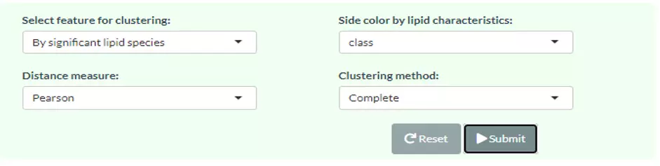
Figure 26 The panel for user to select hierarchical clustering method for ‘lipid species analysis’.
When hovering over the cells of the heatmap, the name of the sample(column) and the name of lipid species, and the value is the z-score of expression in the row direction. If moving to the row annotation (right-hand side), the value will be the option that you select in pull-down menu: ‘Side colour by lipid characteristics’ (i.e. totaldb). The top annotation indicates the group of samples (e.g. control/experimental).
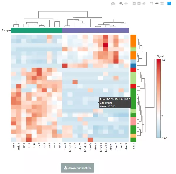
Figure 27 An example of a heatmap of hierarchical clustering.
2.2.2.3 Characteristics analysis
In this part, we categorize significant lipid species based on different lipid characteristics and visualise the difference between control and experimental groups by applying log2 Fold Change.
The characteristics in the demo dataset including class, structural category, functional category, total length, total double bond (totaldb), hydroxyl group number (totaloh), fatty acid length (FA_length), the double bond of fatty acid(FA_db), hydroxyl group number of fatty acid(FA_oh) can be assessed by clicking the pull-down menu. Moreover, the bar chart shows the significant groups (values) with mean fold change over 2 in the selected characteristics by colours, red representing significant, while black meaning insignificant. For example, 2 (double bonds) is one of the significant group when choosing FA_db. Next, the lollipop chart is another way to compare multiple values simultaneously and it aligns the log2(fold change) of all significant groups(values) within the selected characteristics. Lastly, the word cloud on the bottom shows the count of each group(value) of the selected characteristics. Note, the cut-off and data of these plots are according to the input from step1.
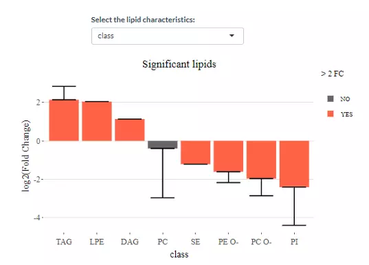
Figure 28 The bar chart shows the significant groups with mean fold change over 2 in the selected characteristics by colours.
 of all significant groups(values) within the selected characteristics (class).webp)
Figure 29 An example of the lollipop chart with log2(fold change) of all significant groups(values) within the selected characteristics (class).
 of the selected characteristics.webp)
Figure 30 An example of a word cloud with the count of each group(value) of the selected characteristics.
2.2.2.4 Enrichment
Enrichment plot assists users to determine whether significant lipid species are enriched in the categories of the selected characteristics.
In term of the usage of this function, the lipid characteristics (9 characteristics in the demo dataset) can be chosen by using the pull-down menu and the p-value cut-offs can be either entered 0.05 or 0.001.

Figure 31 Panel for users to select enrichment method.
The enrichment plots and a summary table are further classified into up/down/non-significant groups by log2 fold change of significant lipid species. Each group (value) of the selected characteristics will have a value of significant count and p-value within a summary table (e.g. When choosing class, under ‘UP & DOWN’, the group of PC O- has 9 significant species out of 31 with a p-value of 0.017). Note, a lipid species may have more than one fatty acid attached. Thus, if the selected lipid characteristics are FA-related term, instead of counting species, we decompose lipid species into FA then do the enrichment. Also, all data used in this analysis is derived from the results of the differentially expressed analysis.
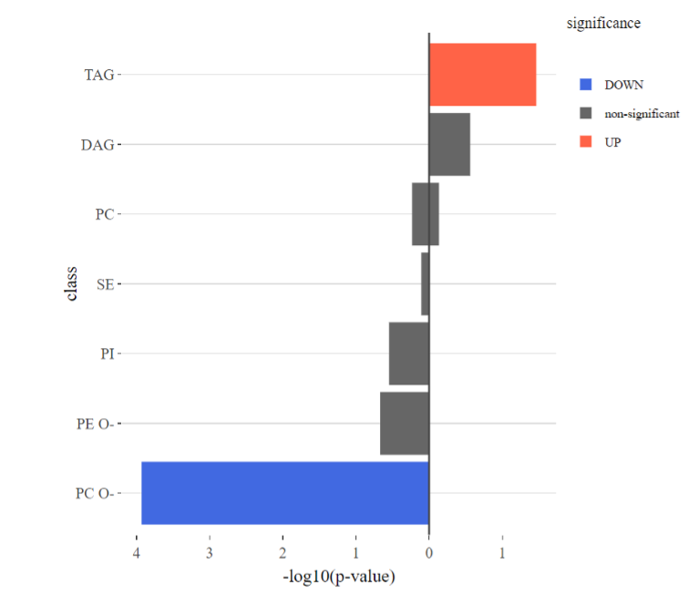
Figure 32 The enrichment plots for up/down/non-significant groups.
Then, only when the selected lipid characteristic is ‘class’, KEGG pathway analysis can be executed by clicking ‘Start Analysis’. The names of significant lipid classes in enrichment analysis will be matched to our mapping table and find corresponding KEGG compound ID and KEGG pathways. A list of lipid characteristics will show on the table, which attached with a radio button that can be selected. Once the name of lipid classis selected, the KEGG pathway of the term will be depicted below.
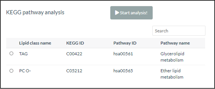
Figure 33 Selecting Lipid Class for KEGG pathway analysis
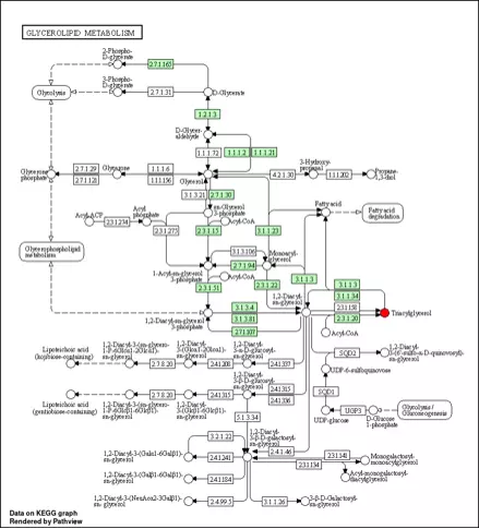
Figure 34 An example of KEGG pathway.
As for the abbreviation, the structural_category includes GL: glycerolipid; GPL: glycophospholipid; SL: saccharolipid; and STE: steroidal. The function_category of lipid are storage (STO), membrane (mem) or lysosomal (LYS).
2.3 Lipid Characteristics Analysis
2.3.1 Step1: Differentially expressed analysis
The massive degree of structural diversity of lipids contributes to the functional variety of lipids. The characteristics can range from subtle variance (i.e. the number of a double bond in the fatty acid) to major change (i.e. diverse backbones).
In Lipid Characteristics Analysis section, lipid species are categorised and summarised into new lipid expression table according to two selected lipid characteristic, then conducted differential expressed analysis. Samples will be divided into two groups based on the Group Information of input data. Two-way ANOVA is applied with t-test as post hoc tests. This Differentially Expressed Analysis section separates into 2 sections, analysing based on first ‘Characteristics’ and adding ‘Subgroup of characteristics’ to the analysis. The first section is analysed based on the first selected ‘characteristics’ . The second section is the subgroup analysis of the first section. In short, lipid species will be split by the characteristic that user-chosen in the second pull-down menu then undergo the first section analysis. Note that two selected characteristics should be both continuous data and one categorical data with one continuous data. The cut-offs of differentially expressed lipids are inputted by users.
2.3.1.1 Usage of differential expressed analysis
The procedure of Lipid Characteristics Analysis section is that two-way ANOVA will be used to evaluate the interaction between lipid characteristics (Class, totallength etc.) and group information (control v.s experimental group) on the lipid expression values or percentages (according to selected characteristics). For example, when you pick FA_length in the pull-down menu of `Characteristics` , the result of two-way ANOVA will tell you whether the interaction effect between FA_length and different groups is present. The post hoc test (t-test) will then calculate significance for each length of FA and produce a p-value. In ‘Subgroup of characteristics’ section, users can further choose another characteristic (e.g. class). And then by pulling down the menu, the analysed result from the first section (e.g. FA_length) will be categorised by one of the subgroups (e.g. LPE) of the selected characteristic (e.g. class). The star above the bar shows the significant difference of the specific subgroup of the selected characteristic (e.g. 48 of totallength is significant) between control and experimental groups.
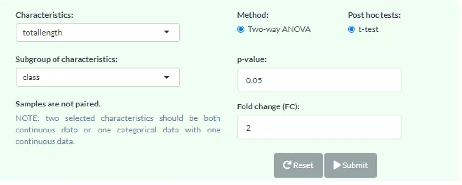
Figure 35 Panel for users to select Characteristics and Subgroup of characteristics.
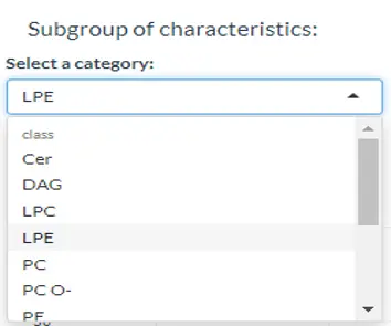
Figure 36 Usage of the subgroup of characteristics.
2.3.1.2 Results of differential expressed analysis
To interpret the diagram, in the first section, the bar chart and line chart both depict the difference between control and experimental groups in each category of the selected characteristics. The box plot reveals the distribution of the characteristics within the control and experimental group. In the second section, these three plots are divided by each second selected characteristic, which allows users to have a detailed look into each subgroup of lipid characteristic. All significant groups in the bar plots and line chart will be highlighted with an asterisk if the group is significant. Additionally, the boxplots using the asterisk rating system to presenting P values, P values less than 0.001 are given three asterisks, less than 0.01 are given two asterisks, and less than 0.05 are given one asterisk (Fig 38). If no line or asterisk is shown, represents no significance between groups (Fig 37).
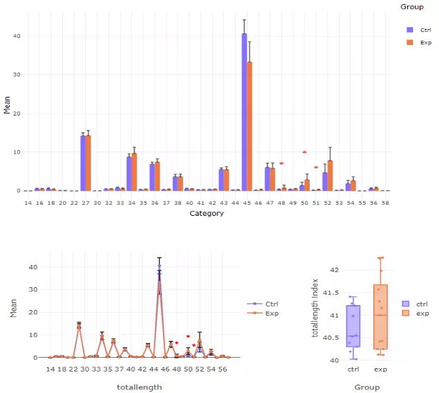
Figure 37 The results of `Characteristics` analysis in the first section.
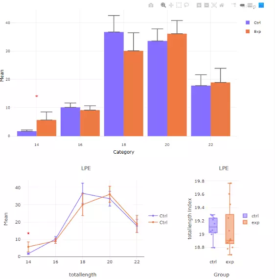
Figure 38 The results of 'Subgroup of characteristics' analysis in the second section
2.3.2 Step2: Visualisation of DE lipids
2.3.2.1 Dimensionality reduction
Dimensionality reduction in this section assists users to tackle with large numbers of variables in lipids analysis. The high-dimensional space is transformed into a low-dimensional space. Hence, the crucial properties of the lipid data are revealed and still close to its intrinsic characteristics.
We offer four types of dimensionality reduction approaches, PCA, PLS-DA, t-SNE, UMAP, and four clustering methods, K-means, partitioning around medoids (PAM), Hierarchical clustering, and DBSCAN. We calculate Principal component analysis with the classical prcomp function. Scaling (by default) and the centring options (by default) can also be adjusted by users. For more information, please find Section 1.3 and 2.2.2.1.
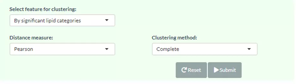
Figure 39 The panel for user to select hierarchical clustering method for ‘lipid characteristics analysis’.
2.3.2.1.1 Results of dimensionality reduction
After users submitting the PCA plot will show. In this section, R package "factoextra" is used to visualize the results. Accompanying with the PCA plot, we offer scree plot criterion, which is a common method for determining the number of PCs to be retained.
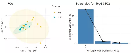
Next, two tables related to PCA are also provided for users to see the contribution to each principal component in each sample and the contribution of each feature (lipid species). By using this information above, users can further decide the top N contribution features and adjusting the slider. The correlation circle on the left will then show the correlation between a feature (lipid species) and a principal component (PC) used as the coordinates of the variable on the PC (2). It shows the relationships between all variables.. The positively correlated variables will be in the same quadrants, while negatively correlated variables will be on the opposite sides of the plot origin. The closer a variable to the edge of the circle, the better it represents on the factor map.
The correlation circle on the left will then show the correlation between a feature (lipid species) and a principal component (PC) used as the coordinates of the variable on the PC (2). It shows the relationships between all variables.The direction (vectors) of the features (lipid species) point out the contribution to the principal components. The positively correlated variables will be in the same quadrants, while negatively correlated variables will be on the opposite sides of the plot origin. The closer a variable to the edge of the circle, the better it represents on the factor map.
Lastly, by adjusting the slider of top N feature on the bottom left, users can have a closer look of the contribution of features to a user-defined principal component (e.g., PC1, PC2 or PC1+PC2). Therefore, in the histogram on the right-hand side, users can find which features (lipid species) contribute more to the user-defined principal component.
2.3.2.2 Hierarchical clustering
New lipid expression table summed up from species will be clustered and shown on the heatmap using hierarchical clustering. Through heatmap, users may discover the difference between the two groups by observing the distribution of lipid characteristic expression. This analysis gives a picture of lipid characteristic expression differences between the control group and the experimental group.
Four distance measures can be chosen, Person, Spearman, or Kendall, and eight clustering methods, median, average, single, complete, Ward.D, Ward.D2, WPGMA, and UPGMC, can be selected by pulling down the menu. Columns are all sample, and rows are the significant characteristic group (value) selected in the first `Characteristics` section from Step1, such as total length of 48, 50, and 51. Please note that if the number of lipids or samples are over 50, the names of lipids/samples will not be shown on the heatmap. More detailed information and interpretation can be obtained from the section 2.2.2.2.
3 Machine learning
In this section, lipid species and lipid characteristics data can be combined by users to predict the binary outcome using various machine learning methods and select the best feature combination to explore further relationships. For cross-validation, Monte-Carlo cross-validation (CV) is executed to evaluate the model performance and to reach statistical significance. Additionally, we provide eight feature ranking methods (p-value, p-value*FC, ROC, Random Forest, Linear SVM, Lasso, Ridge, ElasticNet) and six classification methods (Random Forest, Linear SVM, Lasso, Ridge, ElasticNet, XGBoost) for users to train and select the best model. Feature ranking methods can be divided into two categories: a univariate and multivariate analysis.
A series of consequent analyses assist users to evaluate the methods and visualise the results of machine learning, including ROC/PR curve, Model predictivity, Sample probability, Feature importance, and Network.
3.1 Usage and Data Source
3.1.1 Data Source
For the data sources, users can either upload their datasets or use our Demo datasets. Two necessary tables, ‘Lipid expression data’ and ‘Condition table’ and one optional ‘Lipid characteristics table’ will be passed to the machine learning algorithm. ‘Lipid expression data’ includes features (lipid species) and their expression of each sample while ‘Condition table’ encompasses sample names and user-defined group information composed of 0 and 1.
Besides, ‘Lipid characteristics table’ covers the lipid characteristic information (i.e. Lipid class, structural category, and total double bonds etc.) that can further be applied as additional variables to train a model. Our demo dataset is modified from Li, Haoxin, et al. ‘The landscape of cancer cell line metabolism.’ Nature Medicine (2019)(5). We extracted the lipidomics data from the metabolites divided cancer cell lines into sensitive or resistant to SCD gene knockout evenly based on gene dependency scores (CERES). In details, cancer cell lines with low polyunsaturated fatty acid (PUFA) concentration were more sensitive than Stearoyl-CoA Desaturase (SCD) gene knockout. The cell lines in the upper and lower quartile are picked according to their sensitivity and separated into two groups: ‘Resistant to SCD knockout (1)’ and ‘Sensitive to SCD knockout (0)’. This example allows users to see whether the lipid composition and characteristics will have a combined effect on cellular function or phenotype.
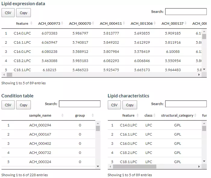
Figure 40 The demo dataset for Machine learning.
In term of data processing, the options are listed below, comprising ‘Remove features with many missing values’, ‘Missing values imputation’, ‘Percentage transformation’, ‘Log10 transformation’, and ‘Data scaling’. ‘Percentage transformation’, ‘Log10 transformation’ can transform data into log10 or percentage. After clicking on ‘Remove features with many missing values’, the threshold of the percentage of blank in the dataset that will be deleted can be defined by users. Additionally, when selecting ‘Missing values imputation’, users can choose minimum, mean, and median to replace the missing values in the dataset. If users select minimum, minimum will be multiplied by the value of user inputted. Lastly, ‘Data scaling’ standardised input values (x-mean/sd). After uploading data, three datasets will show on the right-hand side. When finishing checking data, click ‘Start’ for further analysis.
3.1.2 Usage
Monte-Carlo cross-validation (MCCV) is a model validation technique that we used to create multiple random splits of the dataset into training and validation data, which prevent an unnecessary large model and thus prevent over-fitting for the calibration model (6). With MCCV, users can conduct split-sample CV multiple times and aggregate the results from each to quantify predictive performance for a candidate mode. For each CV, data is randomly split into training and testing data where training data is used to select the top 2, 3, 5, 10, 20, 50 and 100 important features and train a model, which will be validated on testing data. If there are less than 100 features in the user’s data, the total feature number is set as the maximum. The times of cross-validation (CV) and the proportion of data used for testing can be defined by users with the parameters ‘Test data proportion’ and ‘Cross-validation times’. Note, the more ‘Cross-validation times, the longer it takes to calculate the results. Additionally, we give eight feature ranking methods (p-value, p-value*FC, ROC, Random Forest, Linear SVM, Lasso, Ridge, ElasticNet) and six classification methods (Random Forest, Linear SVM, Lasso, Ridge, ElasticNet, XGBoost) for users to train and select the best model.
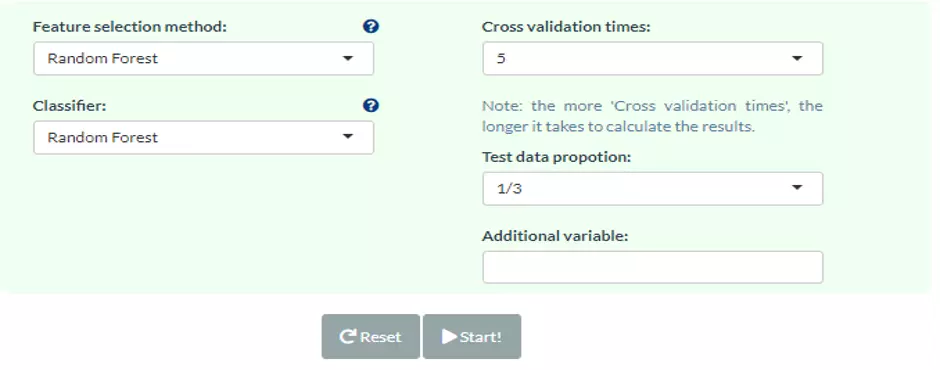
Figure 41 The panel for users to select machine learning methods.
Feature selection methods are aimed to rank the most significant variables to a model to predict the target variable. Our platform provides two categories of feature selection methods: the univariate and the multivariate analysis. Univariate analysis, including p-value, p-value*Fold Change or ROC, compare each feature between two groups and picks top N features based on -log10(p-value), –log10(p-value)*Fold change or Area Under Curve (AUC), respectively according to the user-selected ranking methods. On the other hand, for multivariate analysis, we offer Random Forest, Linear SVM (e1071), Lasso (glmnet), Ridge (glmnet), and ElasticNet (glmnet). Random Forest (ranger) uses built-in feature importance results, while others rank the features according to the absolute value of their coefficients in the algorithm. Note that the names in the bracket are the packages we adopt.
Classification, in brief, is the method that assigns a label of one of the classes to every lipid uploaded by users. Classification methods share similar analysis methods as feature ranking methods, comprising Random Forest, Linear SVM, Lasso, Ridge, ElasticNet, XGBoost. For both processes of ranking and classification analysis are the same in Lasso, Ridge and ElasticNet method. The processes executed in the background are performing 5-fold cross-validation to find the best lambda to fit a model and the iteration is set as 1000 to save running time. Then, the 'nrounds' parameter in XGBoost is also decided by previous 5-fold cross-validation with max_depth=3, early_stopping_rounds=10. Finally, if ElasticNet is selected, users should define the ‘alpha’ value, which is between 0 (=Ridge) and 1 (=Lasso) (figure 1) (7). Except for the above, default values are passed to other parameters in all models. Users are also allowed to introduce one or more lipid characteristics as ‘Additional variables’ to train and test a model from the optional user uploaded table.
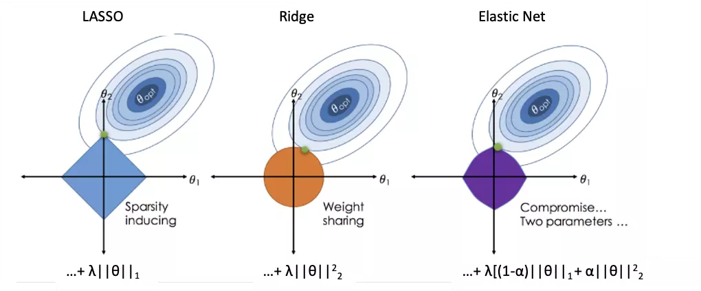
Figure 42 An image visualising how ordinary regression compares to the Lasso, the Ridge and the Elastic Net Regressors. Image Citation: Zou, H., & Hastie, T. (2005). Regularization and variable selection via the elastic net.
3.2 ROC/PR curve
The ROC and Precision-Recall (PR) curve are very common methods to evaluate the diagnostic ability of a binary classifier. Mean AUC and 95% confidence interval for the ROC and PR curve are calculated from all CV runs in each feature number. Theoretically, the higher the AUC, the better the model performs. PR curve is more sensitive to data with highly skewed datasets (i.e., rare positive samples), and offers a more informative view of an algorithm's performance (8). A random classifier yields a ROC-AUC about 0.5 and a PR-AUC close to positive sample proportion. On the contrary, an AUC equal to 1 both represents perfect performance in two methods.
Speaking of interpreting plots, the ROC curve is created with ‘sensitivity’ (proportion of positive samples that are correctly classified) as y-axis and ‘1-specificity’ (proportion of negative samples that are correctly classified) as x-axis based on different thresholds whereas the PR curve is a similar graph with ‘precision’ (proportion of positive samples out of those that are predicted positive) on the y-axis and ‘recall’ (=sensitivity) on the x-axis. Generally, a better model shows a ROC curve approaching the left upper corner and a PR curve around the right upper corner.
To combine the testing results from all CV runs, 300 thresholds evenly distributed from 0 to 1. The thresholds are then calculated the corresponding sensitivity, specificity, precision and recall with predicted probabilities and true labels of testing samples in each CV. These values are then averaged to plot a final ROC and PR curve.
The upper section displays the average ROC and PR curve for different feature number with their mean AUC and 95% confidence interval in the legend. For example, ‘2 AUC-0.962 (0.94-0.985)‘ means when feature numbers are two, the mean AUC is 0.962 and with a 95% confidence interval in 0.94 to 0.985. In the lower section, users can select a certain feature number to see the average of those cross-validations (CVs) (red line) for both ROC and PR curve. Each CVs are in grey. AUC, 95% CI, and p-value are shown in the box.
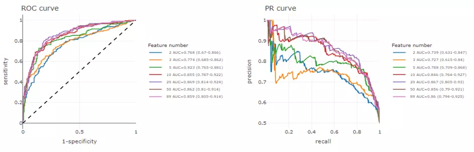
Figure 43 The example of the ROC curve and the PR curve.
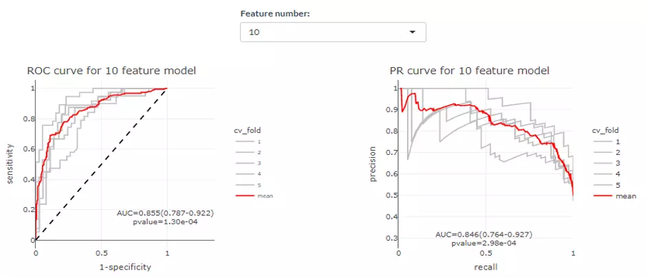
Figure 44 The example of average ROC and PR curve.
3.3 Model Performance
In this part, many useful indicators are provided for users to evaluate model performance. For each feature number, we calculate and plot the average value and 95% confidence interval of accuracy, sensitivity (recall), specificity, positive predictive value (precision), negative predictive value, F1 score, prevalence, detection rate, detection prevalence, balanced accuracy in all CV runs with confusion Matrix function in carat package. All these indicators can be described in terms of true positive (TP), false positive (FP), false negative (FN) and true negative (TN) and are summarized as follows.
Sensitivity = Recall = TP / (TP + FN)
Specificity = TN / (FP + TN)
Prevalence = (TP + FN) / (TP + FP + FN + TN)
Positive predictive value (PPV) = Precision = TP / (TP + FP)
Negative predictive value (NPV) = TN / (FN + TN)
Detection rate = TP / (TP + FP + FN + TN)
Detection prevalence = (TP + FP) / (TP + FP + FN + TN)
Balanced accuracy = (Sensitivity + Specificity) / 2
F1 score = 2 ∗ Precision ∗ Recall / (Precision + Recall)
So, by selecting the pull-down menu, users can view the selected evaluation value (e.g., Accuracy) of each number of features (e.g., 2-42 features). Next, the highest value will be coloured in red, assisting users to assess the number of features they want to use for classification. The detailed information table incorporates all evaluation values mentioned above is also available for download.
.webp)
Figure 45 The example of Model performance (Accuracy).
3.4 Predicted Probability
This page shows the average predicted probabilities of each sample in testing data from all CV runs and allows users to explore those incorrect or uncertain labels. We show the distribution of predicted probabilities in two reference labels on the left panel while a confusion matrix composed of sample number and proportion is laid out on the right. In the ‘Average sample probability in all CVs’ distribution plot, each point represents a sample, which is the mean of the prediction from all models of all Cross Validations. The y-axis is the predicted probabilities of the samples, which means the probabilities that the prediction value of each ML model is one. To depict in detail, the blue group of samples show the probabilities that the true value is one and the prediction value of the sample is also one. The red group illustrates the probabilities that the true value is zero and the prediction value of the sample is also one. Hence, the Black group should be as close to zero, whereas the blue group should be as close to one as possible. In term of the ‘Confusion matrix’ on the right-hand side, the y-axis indicates the predicted class, the x-axis is the actual class. Therefore, the upper left is a true positive; the upper right is a false positive; the lower left is a false negative; the lower right is a true negative. The numbers are the count, while the number in the bracket is the percentage. The probability plot can also be downloaded by hitting the button. Note that results for different feature number can be selected manually by users.
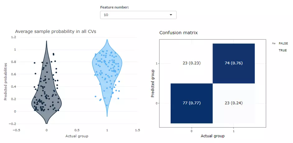
Figure 46 The example of Predicted Probability.
3.5 Feature importance
After building a high-accuracy model, users are encouraged to explore the contribution of each feature on this page. Two methods here namely ‘Algorithm-based’ and ‘SHAP analysis’ can rank and visualize the feature importance.
3.5.1 Algorithm-based
In ‘Algorithm-based’ part, when users choose a certain feature number, the selected frequency and the average feature importance of top 10 features from all CV runs will be displayed. For a Linear SVM, Lasso, Ridge or ElasticNet model, the importance of each feature depends on the absolute value of their coefficients in the algorithm, while Random Forest and XGBoost use built-in feature importance results.
.webp)
Figure 47 The example of Feature importance (Algorithm-based).
3.5.2 SHAP analysis
On the other hand, SHapley Additive exPlanations (SHAP) approach on the basis of Shapley values in game theory has recently been introduced to explain individual predictions of any machine learning model. More detailed information can be found in this paper Li, Haoxin, et al. ‘A Unified Approach to Interpreting Model Predictions’ (2017)(9). For our analysis, based on the result of ROC-AUC and PR-AUC, users can decide the best model and the corresponding feature number. Once users enter the ‘Feature number’, the corresponding best model in all CVs will be used to compute approximate Shapley values of each feature for all samples with fastshap package in R. On top of that, except XGBoost, Monte Carlo repetitions are conducted to estimate each Shapley value and the simulation times are defined by the parameter ‘Simulation times’. Although it might take some time, more repetitions are suggested to achieve accurate results.
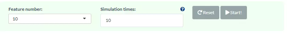
Figure 48 The panel for users to select the number of features and Simulation times.
In the SHAP Feature Importance on the upper left panel, the top 10 features will be ranked and demonstrated according to the average absolute value of shapely values from all samples. Also, SHAP Summary Plot on the upper right shows the distribution of all shapely values for each feature. It uses sina plot to present more important features by a more binary pattern. The colour exemplifies the value of the feature from low (yellow) to high (purple), which indicate the variable is high/low for that observation. The x-axis presents whether the impact is positive or negative on quality rating (target variable). In the summary plot, the relationship between the value of a feature and the influence on the prediction is shown. For the exact form of the relationship, SHAP dependence plots present more details.
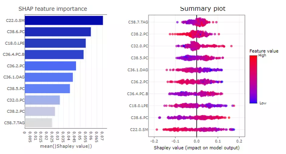
Figure 49 The example of SHAP feature importance plot and SHAP Summary plot.
Users can also build the SHAP force plot and dependence plot with different parameter sets on the lower section. The SHAP force plot stacks these Shapley values and shows how the selected features affect the final output for each sample. The bar colours of the SHAP force plot are filled with the features. ‘Show top N feature’ and the samples are clustered into multiple groups (‘Number of group’) based on Shapley values using ward.D method. In the lower-left corner, SHAP dependence plot allows users to explore how the model output varies by a feature value. It reveals whether the link between the target and the variable is linear, monotonic, or more complex. The x-axis, y-axis and colour for the plot are all adjustable. Generally, the x-axis represents the value of a certain feature while the y-axis is the corresponding Shapley value. The colour parameter can be assigned to check if a second feature has an interaction effect with the feature we are plotting.
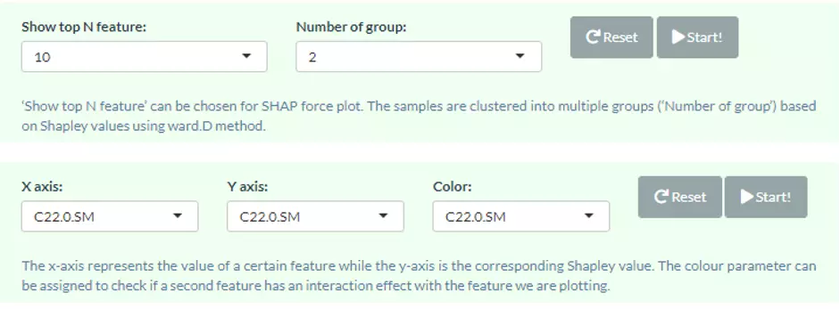
Figure 50 The panel for users to select top N feature and Number of group.
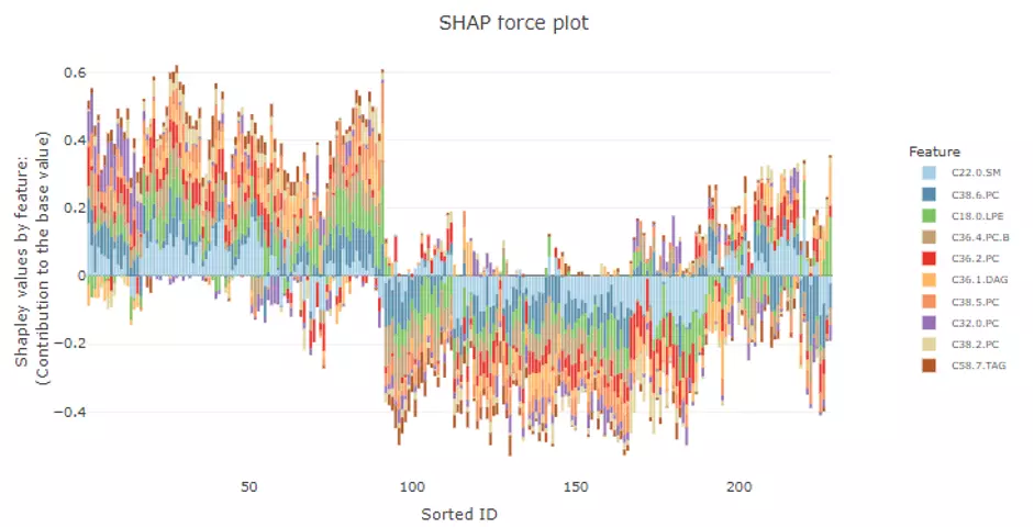
Figure 51 The example of SHAP force plot.
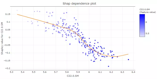
Figure 52 The example of SHAP dependence plot.
3.6 Network
Correlation network helps users interrogate the interaction of features in a machine learning model. In this section, users can choose an appropriate feature number according to previous cross-validation results and the features in the best model (based on ROC-AUC+PR-AUC) will be picked up to compute the correlation coefficients between each other. To build a network, nodes (features) are filled based on feature importance whereas line width represents the value of the correlation coefficient. Two methods including ‘Algorithm-based’ and ‘SHAP analysis’ can be selected to evaluate the feature importance. The detailed information about them can be found in the Feature importance part. Please note that we assign a plus or minus to feature importance in SHAP analysis here based on the direction of feature values and Shapley values of samples. We also provide three correlation types such as Pearson, Spearman and Kendall to conduct. Finally, a coefficient cut-off ranging from 0 to 1 can be adjusted to hide the lines with absolute values of correlation coefficients lower than this cut-off.
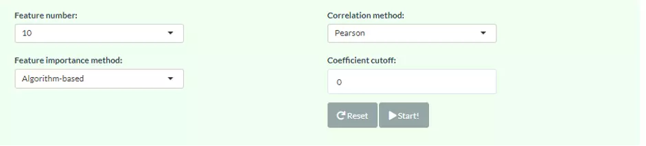
Figure 53 The panel for users to select Network methods and parameters.
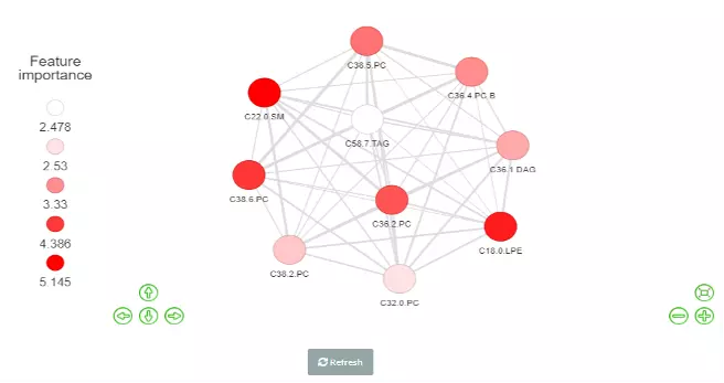
Figure 54 The Network of Feature importance.
4 Correlation
In this section, we provide a comprehensive correlation analysis to assist researchers to interrogate the clinical features that connect to lipids species and other mechanistically relevant lipid characteristics. Correlation analysis between lipids and clinical features is broadly used in many fields of study, such as Bowler RP et al. discovering that sphingomyelins are strongly associated with emphysema and glycosphingolipids are associated with COPD exacerbations(10). Hence, continuous clinical data can be uploaded here, and diverse correlation analyses are offered. For instance, the Correlation Coefficient and Linear Regression are supported for continuous clinical data. Moreover, lipids can be classified either by lipid species or by lipid categories when conducting these correlation analyses.
4.1 Data source
For the data sources, users can either upload their datasets or use our Demo datasets. The datatype of the dataset must be continuous data.
4.1.1 Try our example
Here are the demo dataset (continuous clinical data) that be used as an example in this section: Bowler RP et al. "Plasma Sphingolipids Associated with Chronic Obstructive Pulmonary Disease Phenotypes" (10) (Am J Respir Crit Care Med. 2015). 69 distinct plasma sphingolipid species were detected in 129 current and former smokers by targeted mass spectrometry. This cohort was used to interrogate the associations of plasma sphingolipids with subphenotypes of COPD including airflow obstruction, emphysema, and frequent exacerbations.
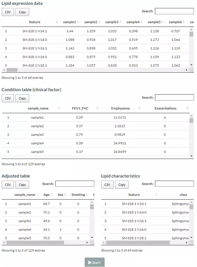
Figure 55 Demo datasets of Correlation analysis.
4.1.2 Upload your data
The dataset needs to contain two tables, ‘lipid expression data’ and ‘condition table’. ‘Lipid expression data’ includes features (molecule, lipid class etc.) and their expression of each sample. While the condition table encompasses sample names and clinical conditions (disease status, gene dependence score etc.), which assigned each sample to a specific condition for further association analysis. Another optional tables for adjustment and lipid characteristics analysis are also can be uploaded by users. Adjust table represents the user-defined variables that will be corrected in linear regression or logistic regression analysis, which can be the cancer types or the clinical information, like gender, age, or BMI. Whereas the ‘Lipid characteristics table’ covers the lipid characteristic information (i.e. Lipid class, structural category, and total double bonds) that further applied to the ‘Lipid category analysis’ as the options.
Lipid dataset can be uploaded by users or using example datasets. This information, namely Lipid expression data , Condition table , Adjusted table (optional), and Lipid characteristics (optional), needs to be uploaded in CSV format with the name of lipids in the first column. Data processing options are listed below, comprising ‘Remove features with many missing values’, ‘Missing values imputation’, ‘Percentage transformation’, ‘Log10 transformation’. ‘Percentage transformation’, ‘Log10 transformation’ can transform data into log10 or percentage. After clicking on ‘Remove features with many missing values’, the threshold of the percentage of blank in the dataset that will be deleted can be defined by users. Additionally, when selecting ‘Missing values imputation’, users can choose minimum, mean, and median to replace the missing values in the dataset. If users select minimum, minimum will be multiplied by the value of user inputted. After uploading data, three datasets will show on the right-hand side. When finishing checking data, click ‘Start’ for further analysis.
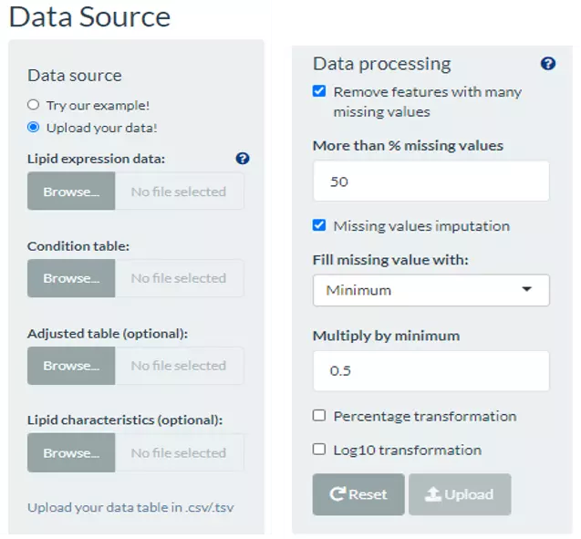
Figure 56 The panel for users to upload data and select data processing approaches.
4.2 Usage of Correlation
The correlation analysis can be conducted by both lipid species and lipid category. This section is designed for continuous clinical data. Two correlation analyses are accessible, Correlation Coefficient, and Linear Regression. A heatmap will be shown once the correlation analysis is completed. Clustering methods are also available: the distance measurement, including Pearson, Spearman, Kendall, Euclidean, Maximum, Manhattan, Canberra, Binary, or Minkowski; the clustering methods, including median, average, single, complete, Ward.D, Ward.D2, WPGMA, and UPGMC. After submitting, a heatmap depicted the pattern between lipid species/lipid characteristics and clinical features will show with a matrix that is ready for download. Please note that if the number of lipids or samples are over 50, the names of lipids/samples will not be shown on the heatmap.
4.2.1 Lipid Species Analysis
The following correlation analysis is conducted after lipids classified by lipid species.
4.2.1.1 Correlation
The Correlation Coefficient gives a summary view that tells researchers whether a relationship exists between clinical features and lipid species, how strong that relationship is and whether the relationship is positive or negative. Here we provide two types of correlations, Pearson, and Spearman, then adjusted by Benjamini & Hochberg methods. The cut-offs for correlation coefficient and the p-value can be decided by users. Rule of thumb in medical research recommended by Mukaka for interpreting the size of a correlation coefficient has been provided below (11).
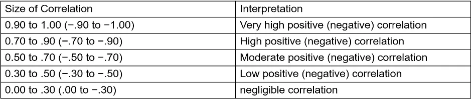
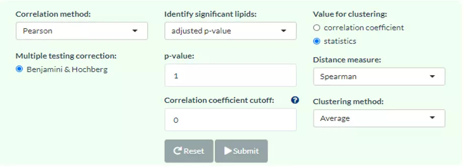
Figure 57 Panel for users to select correlation method, parameters and clustering method.
A heatmap will show after users inputting cut-offs and choosing a value for clustering/methods for clustering. Users can use either correlation coefficient between clinical features (e.g., genes) and lipid species or choose their statistic instead as clustering values. Note that only the variables pass the user-defined cut-offs for p-value and correlation coefficient will be shown on the heatmap. The rows of the heatmap will show clinical features, whereas the columns illustrate the lipid species. Please note that if the number of lipids or samples are over 50, the names of lipids/samples will not be shown on the heatmap.
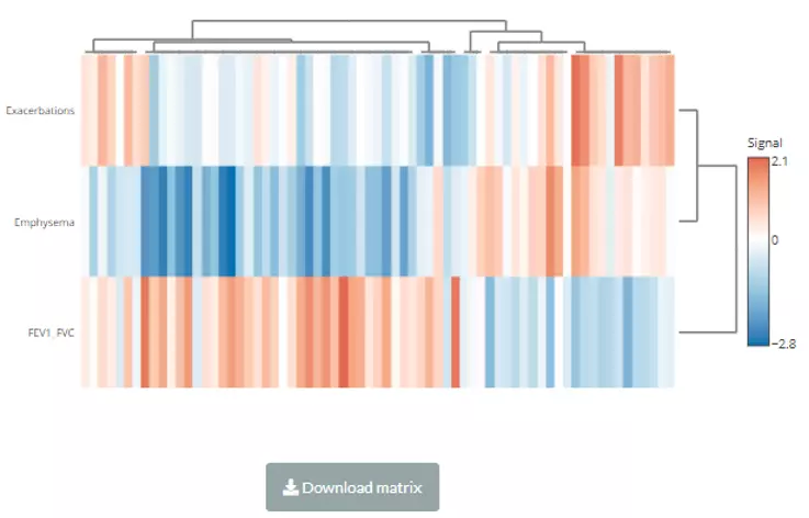
Figure 58 The heatmap of the Correlation Coefficient for Lipid Species Analysis.
4.2.1.2 Linear Regression
Linear regression is a statistical technique that uses several explanatory variables to predict the outcome of a continuous response variable, allowing researchers to estimate the associations between lipid levels and clinical features. For multiple linear regression analysis, additional variables in ‘adjusted table’ will be added into the algorithm and used to adjust the confounding effect. Once calculation completes, each lipid species will be assigned a beta coefficient and t statistic (p-value), which can be chosen for clustering.
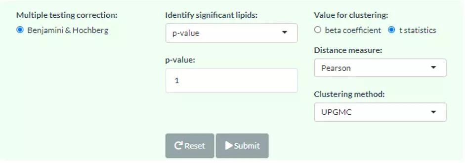
Figure 59 The panel for users to select cut-offs and clustering methods.
A heatmap will show after submitting. Note that only the variables pass the user-defined cut-offs for p-value and correlation coefficient will be shown on the heatmap. The rows of the heatmap will show clinical features, whereas the columns illustrate the lipid species. Please note that if the number of lipids or samples are over 50, the names of lipids/samples will not be shown on the heatmap.
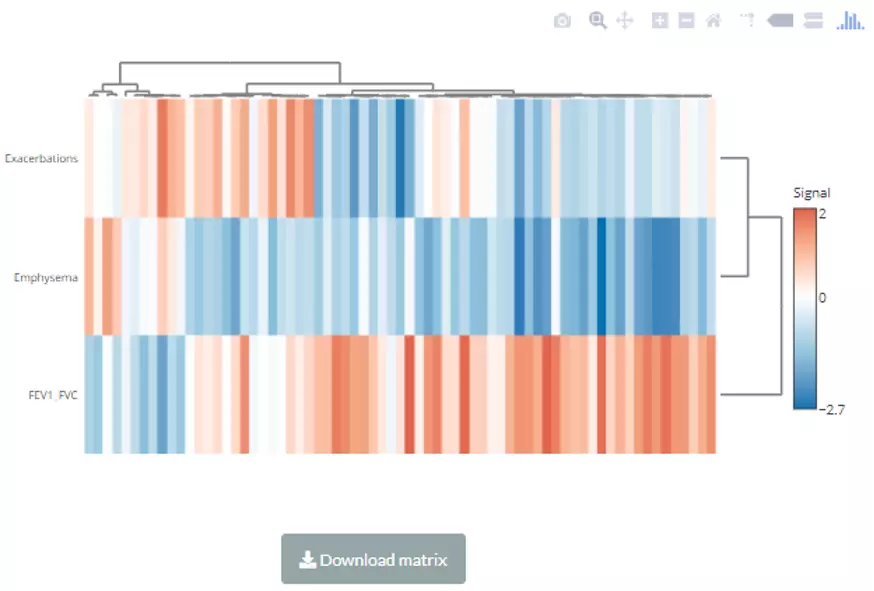
Figure 60 The heatmap of linear regression for Lipid Species Analysis.
4.2.2 Lipid Characteristics Analysis
The following correlation analysis is conducted after lipids classified by lipid characteristics that from users uploaded table ‘Lipid characteristics’.
4.2.2.1 Correlation
The Correlation Coefficient gives a summary view that tells researchers whether a relationship exists between clinical features and user-defined lipid characteristics, how strong that relationship is and whether the relationship is positive or negative. So, user can choose one of the lipid characteristics, then two types of correlations, Pearson, and Spearman, are provided. The data will be adjusted by Benjamini & Hochberg methods. The cut-offs for correlation coefficient and the p-value can be decided by users. Rule of thumb in medical research recommended by Mukaka for interpreting the size of a correlation coefficient has been provided below (11).
As for the settings of the heatmap, the cut-offs and choosing a value for clustering/methods for clustering. Users can use either correlation coefficient between clinical features and lipid characteristics or choose their statistics instead of clustering values. Note that only the variables pass the user-defined cut-offs for p-value and correlation coefficient will be shown on the heatmap. The rows of the heatmap will show clinical features, whereas the columns illustrate the lipid characteristics. Please note that if the number of lipids or samples are over 50, the names of lipids/samples will not be shown on the heatmap.
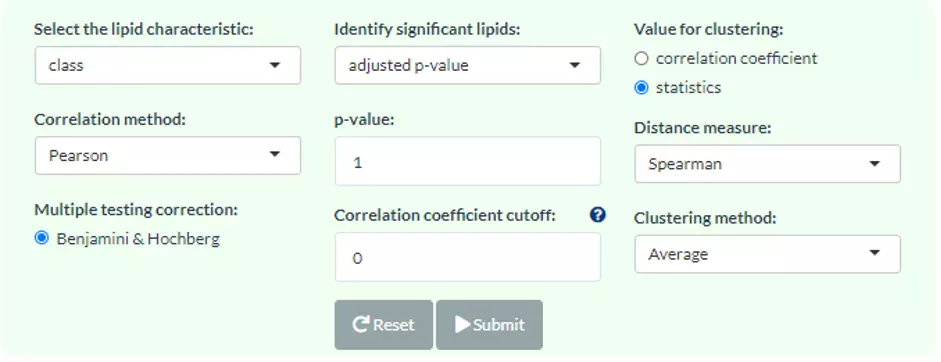
Figure 61 The panel for user to choose a lipid characteristic, correlation methods, values for clustering, and other parameters.
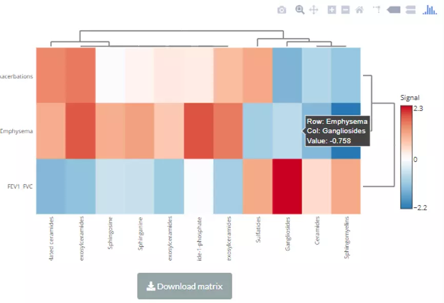
Figure 62 The interactive heatmap of correlation for Lipid Category Analysis.
4.2.2.2 Linear Regression
Linear regression is a statistical technique that uses several explanatory variables to predict the outcome of a continuous response variable, allowing researchers to estimate the associations between lipid levels and clinical features. In this page, the lipids will be classified and summed by the user-selected lipid characteristics (e.g., class), then implementing univariate or multivariate linear regression analysis according to whether there is an ‘adjusted table’. Each component in the selected characteristics will be assigned a beta coefficient and t statistic (p-value), which can be chosen for clustering.
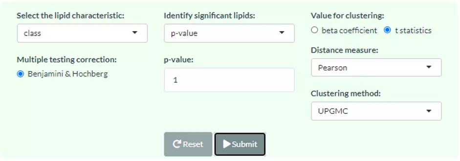
Figure 63 The panel for user to choose a lipid characteristic, values for clustering, and other parameters.
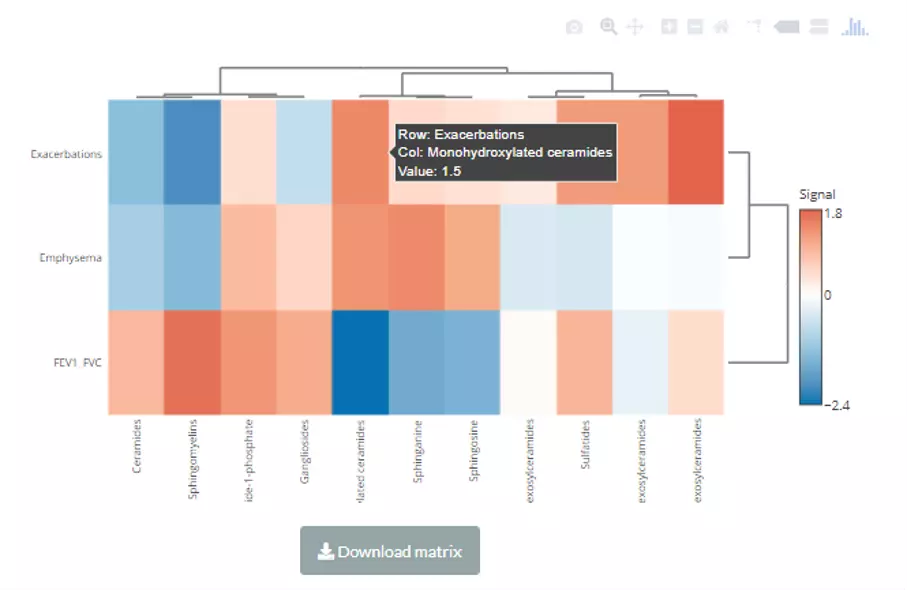
Figure 64 The interactive heatmap of Linear regression for Lipid Category Analysis.
5 Network
Our platform constructs two types of networks for users to investigate the lipid metabolism pathways and lipid-related gene enrichment. The ‘Reactome Network’ contains the interaction of multiple lipids and genes and are summarized from the Reactome database, which is a curated database encompassed pathways and reactions in human biology(12). For enrichment network, selected lipids will be mapped to the corresponding genes and we use KEGG(13), Reactome, and Gene Ontology (GO)(14) databases to undergo the further enrichment analysis.
5.1 Reactome Network
This function supports users to discover the metabolic networks between small molecules within Reactome Network topologies and their interactions with proteins. Reactome currently encompasses comprehensive aspects of lipid metabolism include lipid digestion, mobilization, and transport; fatty acid, triacylglycerol, and ketone body metabolism; peroxisomal lipid metabolism; phospholipid and sphingolipid metabolism; cholesterol biosynthesis; bile acid and bile salt metabolism; and steroid hormone biosynthesis. We integrated the reactions in these pathways and explore the metabolic flow and regulatory proteins of the inputted lipids. This information will be used to build an interactive network containing different nodes such as Biochemical Reaction, Small Molecule, Protein or Complex.
To obtain the Reactome Network, the user can define the lipid class by typing in or select from the pull-down menu. ‘Number of the path’ means the N shortest paths will be searched between each pair of selected lipid classes. Besides, ‘Maximum path length’ controls the maximum length of these paths and we removed those over this threshold. Note, the more lipid classes or ‘Number of the path’, the more time it takes to search all paths and plot the network.
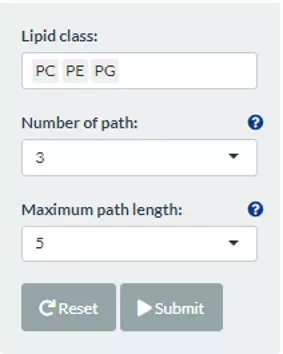
Figure 65 The panel for users to select lipid classes and criteria for Reactome Network.
After submitting input, the interactive Reactome network can be shown on the left-hand side. Relevant molecules/pathways can be emphasised by clicking on the desired node and adjusting positions by users. Another option is clicking on the pull-down menu at the upper left of the plot, the chosen lipid class or the whole group (of Biochemical Reaction, Complex, Protein or Small Molecule) will be highlighted.
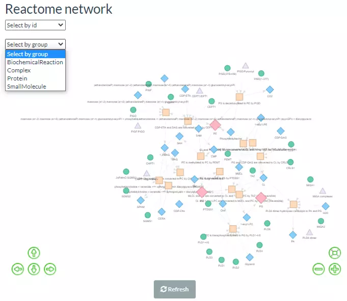
Figure 66 Reactome Network, using PC, PE, and PG as example.
In terms of the table below, the ‘path’ refers to the pathway between selected lipid classes. The ‘path rank’ is the rank of the pathway that linked the selected lipid classes (e.g. PE-PC), ranking by the length of the pathway; the shorter length, the higher rank. The ‘Node order’ and the ‘Node name’ are also shown in the columns.
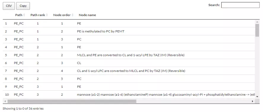
Figure 67 An example of a table comprising information of Reactome Network.
5.2 Lipid-related gene enrichment
In this page, a multi-omics analysis is provided to associate the lipids with gene function and a similar method has been used to identify relevant pathways of altered metabolites (12). More specifically, R package, graphite(15)/ metaGraphite(16) is used to query the lipid-related genes for lipid classes in KEGG and Reactome databases. These genes are directly connected to lipid candidate through metabolic reaction, binding etc., and will be adopted for further enrichment analysis.
By summarising the pathways from KEGG, Reactome, and GO databases, we present the functions networks of the user-defined lipid-related gene sets. The mapped genes of the user-selected lipid class will be enriched and illustrated in the circular network diagram, which allows users explore the significant functions and the relationship between lipid-related pathways and genes based on their lipid classes.
To discover the enriched pathway, the lipid classes can be chosen by users either by typing in or selecting. KEGG, Reactome, GO:BP/CC/MF are provided in this section as the database for enrichment by using Fisher’s exact test. P-value can be altered by users. The ‘Top N significant terms’ is based on the -log10(p-value), which can present top N terms that are most relevant to selected lipid classes. ‘Genes similarity’ calculates the intersection of genes in term1 and genes in term2, then divided by the number of the genes of term1 or term2.
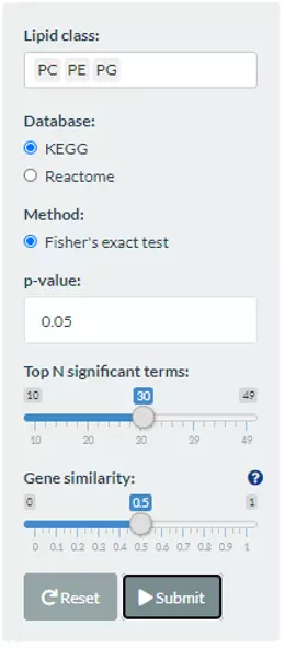
Figure 68 The panel that can choose lipid classes and database for the Lipid-related gene enrichment.
Next, after submitting, the network will be shown on the left with the colour indicating the -log10(p-value) and the size of the node representing the number of genes in the terms.
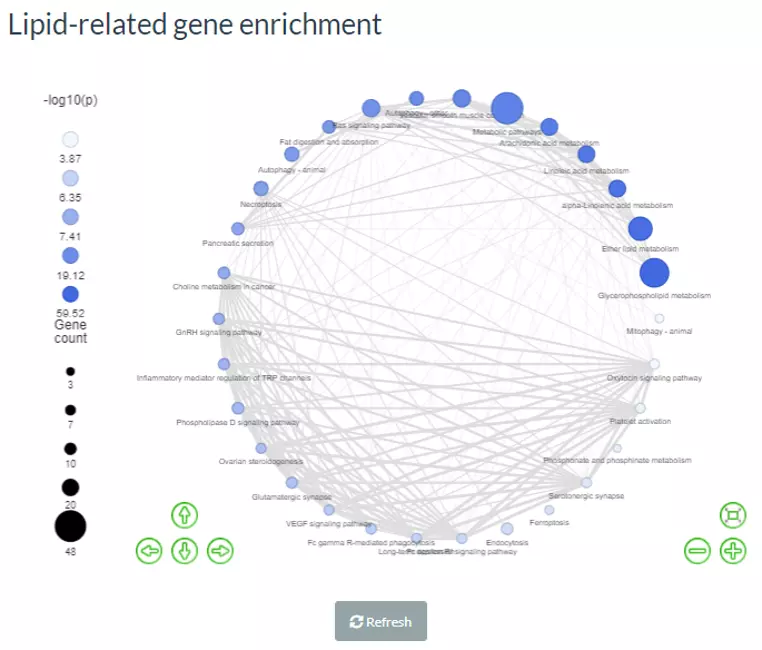
Figure 69 The example of Lipid-related gene enrichment for PC, PE, and PG.
As for the table below, the first column, ‘pathway’ is the pathway enriched by those genes that are related to user-defined lipid classes. The ‘Lipid gene number’ and ‘Pathway gene number’ record the numbers of matched lipid-related genes and total genes in the pathway, respectively. The ‘Lipid gene symbol’ shows matched lipid-related genes within that pathway, which is provided by the database above. ‘-Log10(p-value)’ is the mean of the -log10(p-value) of those genes in ‘Pathway gene number’.
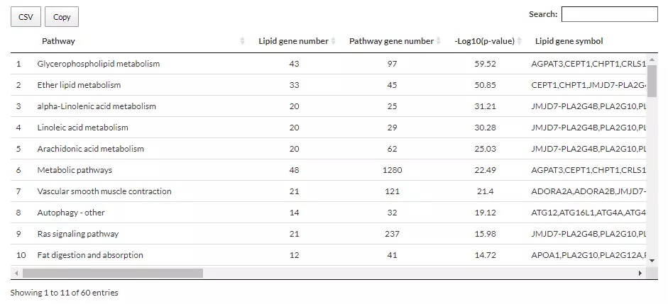
Figure 70 The table providing information on Lipid-related gene enrichment for PC, PE, and PG.